Allow Your Content To Respond To The Viewers Device
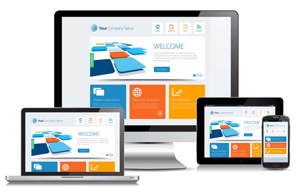 With so many people now using their mobiles and tablets to access the internet, having a site that’s optimised for the best user experience possible is a must. The size of the average phone is changing almost monthly with Apple bringing our ove rsize mobile such as the 6s plus and of course tablets. This means your website should be “responsive” and adjust to the user’s device as required.
At Lupee Web Design, we specialise in creating responsive web designs that not only look great but function perfectly too. If you’re considering a responsive web design for your business, it’s useful to be aware of the differences between a responsive design and mobile design as well as what the main benefits of having a responsive design are.
Many people incorrectly assume that the term Mobile website is the same as a Responsive website. This simply isn’t the case.
A mobile website is normally created after the main design and is served to viewers on a mobile device. The design cannot adjust to the views screen size. However a responsive website will respond to the screen size of the viewing device and will offer the best visual experience regardless of the size of the device.